Complete Guide to Standard Script Formats
Remembering the book that ruled the movie industry

When I was writing genre films for Cannon, Vestron and a collapsing balloon of promising studios, entrepreneurs, artists and gamblers, the screenplay was “the thing.” You had to have a screenplay to raise funds.
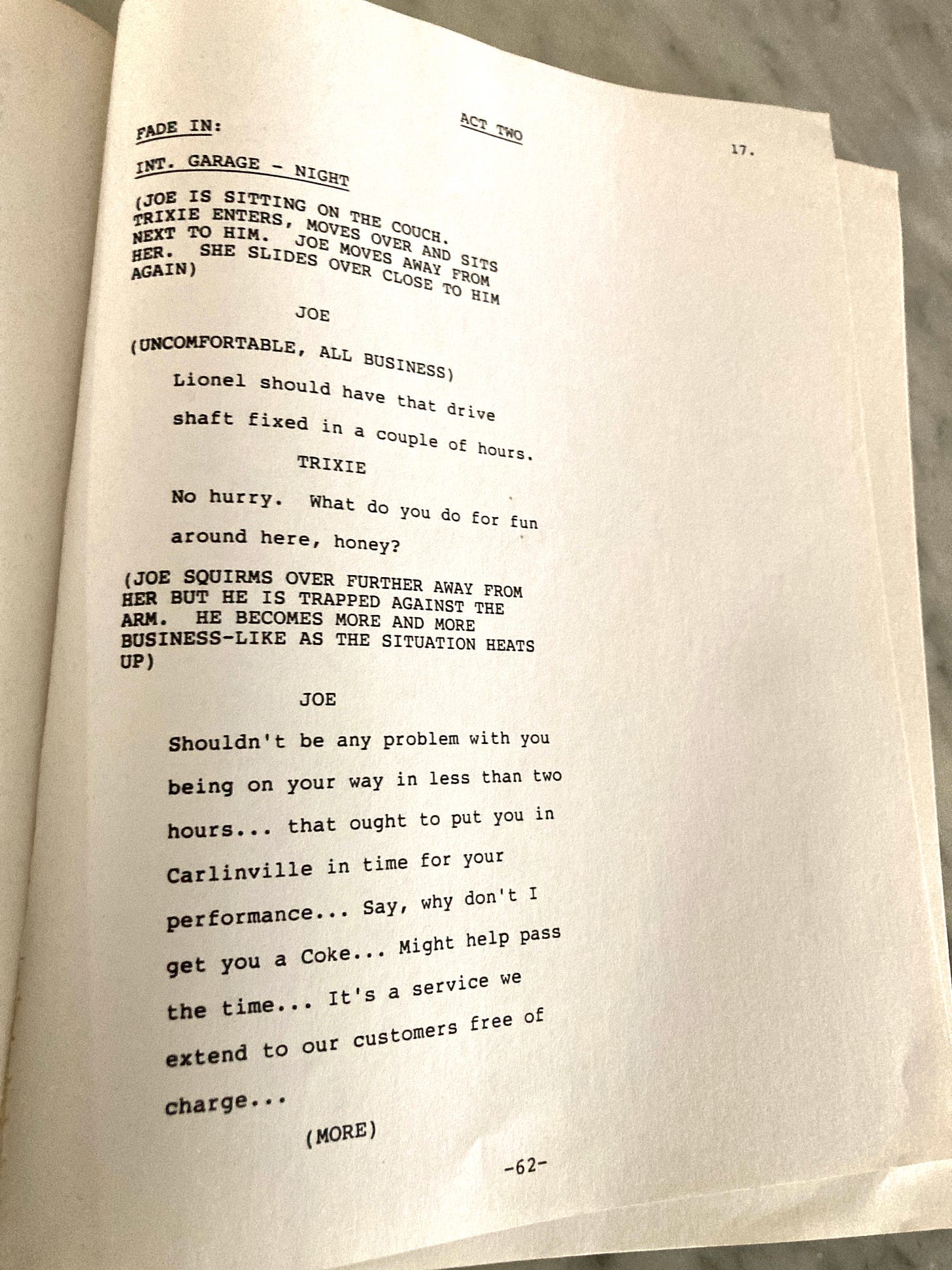
For the screenwriter it was most important that the screenplay looked right, felt right, smelled right. The image of the executive weighing the screenplay in his hands was not a joke.
Producers measured their screenplays by the paper packaging and standardization of our most sinful thoughts.
But to jump out of that we had to make sure that our submissions were picture perfect.
These were the typewriter days. I used a manual Hermes 3000 typewriter, such a wonderful object that the novelist William Kotzwinkle wrote a book with the title.
Tying on an 8 ½” x 11” piece of paper is not conducive to creativity and the dubious continuity of the parenthesis “cont’d” — plus the questionable punctuation — made it almost impossible to create a coherent page without awkward breaks or long areas of open space on the page.
Oh and there was the endless debate about short dashes, long dashes, how many dashes, and the spaces between them. All this was counter to the creative process, at least in terms of the finished screenplay.
As for the art of printing, grammar and communications, it remains worth studying.
For newspapers, the AP Stylebook is the authority on writing and editing style. For many printed works, the Chicago Manual of Style holds sway. The unwieldy New York Times Manual of Style and Usage is good to keep on the shelf. Others say E.B. White’s “Elements of Style” is all you need.
Then it was “The Complete Guide to Standard Script Formats, Part 1: The Screenplay” by Hillis R. Cole Jr. and Judith H. Haag. The copy I have was the fourth printing, 1979 It was almost impossible to find, only to be located at an out-of-the-way Hollywood theater bookshop with limited hours. I probably took the last copy. It was expensive for a paperback: $16.95.
But inside was a world of magic.
The foreward (not “forward”) by James F. Boyle, the screenwriting instructor in the cinema department of the University of Southern California, boldly proclaims: “This book is not a typing manual, it is a look at the fine line between content and form on the script.”
“If a script is well typed, well designed, then the producer has the feeling that the author might have a grasp on the content, style, and dialogue. However, if the screenplay is written with the wrong design, it may be an indication that the author is only a beginner, unable to handle the content well.”
There it is in plain print: Format is everything.
The book offers 161 — yes, 161 — rules to be adhered to, including six subchapters under the heading: “STAGE DIRECTION: KNOW WHAT TO CAPITALIZE.”
I remember having a debate about ellipsis with my director friend Jeff Delman (“Deadtime Stories.”) Was there a space on both side of the ellipsis? Even Cole and Haag didn’t answer this question.
The Courier 12 font was non-negotiable, the only font permitted. Violators could expect their scripts to be tossed to the scrap heap before turning to the character page. Woe, woe unto the Helvetica user!
I was a valuable commodity back then because I could type, something that was not widely mastered. I took the job seriously enough to obsess over those indentations — and God forbid two spaces instead of one! There was no search-and-replace function at that time and more than once I retyped screenplays to close the dots.
Woe, woe unto the Helvetica user!
Xeroxing was insanely expensive then and I inevitably spent a large portion of my pocket money on copies and bindings. Oh and those had to be just right, with brads and just the right type. Was it two-hole punch or three? Covers were generally frowned upon, but there were stories of daring screenwriters who would have art or imagery on their cover. One writer was so bold as to include a photo of himself accompanying his screenplay.
I don’t know what scripts look like now, but I cling to my Cole/Haag “Formats” as a souvenir.
“Good, if a bit dated,” wrote an Amazon reviewer in 2015.
Judith Haag published part II of “The Complete Guide to Standard Script Formats: Taped Formats for Television.”
I’m not sure if it had the same success. But it’s still fun to read.

The last I heard 25 or 30 years ago there was a program called MovieMaker that did what needed to be done to make screenplay format. AI is perfect for this and their formatting flawless.
If they only knew how many hours of calculating tabs, indents and margins, debating capitalization, page numbering, continued lines, page breaks not to mention stylistic intentional usage like ALL CAPS and a multiple array of exclamation points, as when scripting a horror thriller:
“ARGHHHHH!!!!!!” — or “ARGH!” — or . . . (….) “WRITER issues a blood-curdling scream in mad frustration!”
OOPS — you’re supposed to CAP character names. Make that “WRITER issues a blood-curdling scream in mad frustration.”


